


Image competition Mind Map
![]()
PHOTO COMPETITION PREP: A FRESH LOOK AT THE 12 ELEMENTS
BY LISA DILLON, M.PHOTOG.CR., CPP, AND BRYAN WELSH, CR.PHOTOG., API 3.24.2017
One of the most daunting sentences you can hear as a novice competitor in PPA's International Photographic Competition is “Entries are judged using the 12 Elements of a Merit Image.” What are these 12 elements? Where can you find them? And most of all, what do they mean?
If you’re new to image competition, it can feel like a game. It’s possible you have only a passing familiarity with the 12 Elements of a Merit Image. Yes, the list is displayed at every image competition and a short description of each element can be found on the PPA website. But do you really understand what they mean? Do you understand how they underpin one another and build upon one another?
Many people believe these elements are listed in order of importance but a brief conversation with Randy McNeilly, M.Photog.MEI.Cr., CPP, API, F-ASP, former chair of IPC, confirmed our belief that this is not true. Impact is often touted as the most important element of all, but you can’t really separate impact out as separate element. Impact is what you get when all the other elements are working together in concert. For us, impact is a result rather than an independent element.
So rather than looking at the elements as a linear catalog or a checklist, our brains saw them as more of a constellation of interconnected elements with some in a slightly more subordinate position and others in a more prominent position, but all working together to create impact. We created this mind map to explain how we see these elements working together, assembled in logical groupings.
Print Competition Mind Map
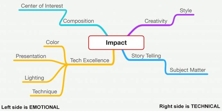
Impact takes the center of the map, with the rest of the elements leading in to it. We broke the element list apart and created four major areas, or pillars: composition, creativity, technical excellence, and storytelling. Branching off these four major components are the elements that support each pillar. You’ll also notice that the left side of the mind map covers the more technical aspects while the right side of the mind map covers the more emotional aspects.
We grouped color (sometimes called color balance or color harmony), presentation, lighting, and technique together as the elements that make up technical excellence. You can’t have technical excellence if your white balance is off or your colors are fighting against each other. And the way you present your image at competition is a huge part of technical excellence. If you print your image, you should choose the best media for your subject matter, which could be glossy, metallic paper, art paper, whatever makes the most fitting presentation. Matting should present the image to its best advantage. Image files should be prepared appropriately prior to printing so they can be viewed properly under the strong lights at competition. Digital submissions should have an appropriate digital mat and possibly key line or stroke to frame it.
For lighting, technical excellence is achieved when you’ve chosen the best lighting for that subject in that setting. That means it could be broad light in certain circumstances, depending on the subject and the mood of the image. Or perhaps short light would be the best way to light the subject, particularly if your subject is a woman. But there are other lighting styles—for a fashion or film noir image, the best lighting choice might be butterfly. Given the proper scenario, you might even choose spooky lighting. The actual lighting technique matters much less than whether it supports the subject matter and story you’re trying to tell with that image. Judges look for directionality and intentionality with a lighting scheme—did you choose your lighting intentionally or just take what was given? With photojournalistic images, you may have little or no control over lighting, but you can control where you are and when you press the shutter release.
As an element, technique looks at how you approached the creation of your image. It includes your choice of presentation media (printed or digital; paper selection, and so on), but it goes further than that and includes posing and expression, key (whether the subject’s clothing is in key with the background) and even how the image was captured as well as the post-processing you did after capture. Technique looks at things like digital noise in the capture, moiré, ghosting, chromatic aberration, and other distracting and avoidable elements in an image.
It also looks at post-processing. Is there discernable banding in the processing or the printing? As you processed the image, did you accidently create halos (areas that are lighter or darker around an element in the image caused by sloppy dodging or burning or sometimes from the sharpening technique)? If you applied a texture, is it there to enhance the image or to hide some digital noise? Are there cloning tracks in the image? Are there digital artifacts from oversharpening? Is your white balance off, creating unintentional, unnaturally tinted skin tones in the subject? Is there a color cast on the skin of the subject from strongly colored objects in the scene such as grass or brightly painted walls? When it’s apparent that the skin tones are altered for an overall effect, it’s OK to have a tint to the skin, but when it’s clearly a matter of poorly controlled white balance, it will be a negative factor in your overall technical excellence.
Technique also applies to your black-and-white conversion—is it muddy? Soft and creamy? Snappy and contrasty? And most importantly, is your black-and-white conversion appropriate for the subject and the mood you’re trying to evoke? A soft and creamy black-and-white image might be appropriate for a sweet newborn but could be out of place for a moody, heart-tugging image. As with lighting and presentation, there are no hard and fast rules about which style to choose. As the maker, you need to select the processing that fully supports the story you’re trying to tell and the subject matter.
Color balance provides a sense of harmony to the image, which is why it’s often referred to as color harmony. This harmony can take many forms. Working with complementary colors (colors directly opposite each other in the color spectrum) or analogous colors (groups of three colors that are next to each other on the color wheel) are two ways to ensure that your images will be balanced. However, your colors need not always be harmonious. Sometimes clashing color creates just the right amount of tension for the image, evoking strong feelings and reactions. Not every image needs to be pretty to be effective at conjuring emotion.
When you look at technical excellence as a product of the effective use of color balance, technique, lighting, and presentation, the elements start to make more sense and work together. Instead of being disparate pieces, they are components that go logically together.
When all these elements are thoughtfully and intentionally in place, you achieve technical excellence and that points you toward impact. But the job isn’t done yet. Now let’s look at composition as an element.
We’ve attached center of interest as a component of composition, but there’s much more to a pleasing composition than having a strong center of interest. If, for example, you’re photographing a stand of trees, there might be one that is different enough that it stands out and becomes the center of interest. In that case, the placement of that special tree will greatly determine if your image has a pleasing composition. But sometimes a stand of trees is interesting all on its own for the uniformity of the tree trunks or the strong repetitive pattern and chiascurro (an effect of contrasted light and shadow created by light falling unevenly across the subjects in your image) that the trees create. In cases like that, you won’t have a strong center of interest because the entire image is the center of interest. And truly, sometimes, not having a center of interest is the whole point of the image, such as with an abstract piece or a fine art piece.
But center of interest is just one part of the composition element. Does your image bring viewers into the image and keep them there? Are there leading lines that take you right to the center of interest? Are you working with the rule of thirds? Or are you breaking the rule of thirds intentionally for a specific effect? Are you using mood lines (patterns and lines that convey mood or emotion) to create visual tension? Do the overall lines of the image create a mood that matches the story you are trying to tell with this image? Are you using the Golden Mean as a compositional element in your image?
It’s OK to break rules of composition, but you have to do it with great intentionality and find a way to indicate that you did so knowingly. Sometimes a symmetrical image creates just the right feeling of stability and strength that you need for an image. Other times that same symmetrically can create an image that is too static and the net effect is boredom for the viewer. You have to make sure you know the rules, though, before you try to break them so you can do it effectively and intentionally.
Storytelling is an element that has often been given short shrift because of its place at the bottom of the list. Many people see it last and believe that it’s the least important element. For us, it’s one of the four major underpinnings of impact. Subject matter is an important facet of storytelling, but it’s not the whole thing. There are aspects of storytelling throughout the image—the setting, the props, the expression, the pose, and even the title, which we like to call the 13th element, are all part of storytelling.
Storytelling is further enhanced by your choice of post-processing and possibly even presentation. A vintage-style image might lose some of its impact if it’s printed on glossy paper but that impact could be recovered if it were printed on a paper that supported the vintage feel. For a retro piece, it’s possible that art paper might be a stronger choice. Maybe a torn or deckled edge would go even further into supporting the storytelling aspect of the image.
While not technically an element, titles are a very important component to your competition image. It’s your only chance to actually talk to the judges, so think carefully about what you choose to say. Do you really want to throw away that chance to talk by saying something that a hundred other people have already said? Old and tired titles do little to advance your cause. And some titles have absolutely nothing to do with telling the story of the image and can end up being a stumbling block for judges who are trying to reconcile the two. Use your titles to draw out the story. Point your viewers in the direction you want them to look. After you’ve worked so hard to capture the image, process it perfectly, and then print or prepare it for display, don’t let a mundane, tired, boring, overused, ill-fitting title be the first thing the judges encounter.
The final pillar of the impact is creativity, supported by style. While it’s true that style could support other areas (composition or storytelling, for example), we felt it fit best as a component of creativity. It’s hard to define creativity, but we tend to know it when we see it. Creativity is best defined as the ability to transcend traditional ideas to create meaningful new ideas. We see it with a fresh approach to something that’s been done over and over and over. We see it with imaginative and inventive compositing or styling in an image. An image that shows us a new way to look at something scores high on the creativity and style scale.
The last element to discuss then is impact. As you can see, impact doesn’t just happen. It is the amalgamation of the rest of the elements combined. Bob Hawkins, in his original description of the 12 Elements of a Merit Image, described impact as the sense one gets upon viewing an image for the first time. We call it the wow factor. An image with great impact comes around on the turnstile or pops up on the monitor and you get this momentary cessation of breath. Your mind goes blank for a moment and all you can do is absorb the image before you. Then you can start looking at it from the standpoints of the other elements. Images like this don’t just happen—they are thoughtfully created and nurtured and cultivated through the judicious attention to the other supporting elements. Sometimes one or another of the elements will prevail and take precedence over another (such as when a strongly emotive image will allow storytelling to make up for slight deficiencies in technical excellence). Think of impact as the tabletop with the supporting pillars of composition, storytelling, technical excellence, and creativity. The other elements keep those pillars strong and make sure that the table doesn’t fall over and spill the all-important element of impact.
| Dallas Professional Photographers Association |